데이터 분석을 위해 파이썬에서는 Pandas와 Numpy 그리고 Matplotlib를 제공한다. 이 글에서는 matplotlib 을 사용해 보겠다. matplotlib는 python에서 다양한 시각화 기술을 구현하는 라이브러리이다.
먼저 matplotlib을 사용하기 위해서는 아래와 같이 import 선언을 해주어야 한다.
필자는 matplotlib패키지의 pyplot모듈을 사용하기 위해 plt라는 객체명을 선언하였다.
import matplotlib.pyplot as plt
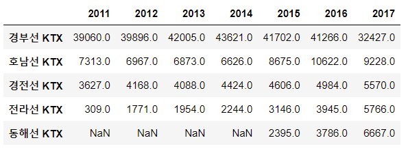
numpy를 사용하여 배열을 먼저 생성해보자
import numpy as np

x = np.arange(-4.5, 5, 0.5)
y = 2 * x ** 2
[x,y]

->
[array([-4.5, -4. , -3.5, -3. , -2.5, -2. , -1.5, -1. , -0.5,  0. ,  0.5,
         1. ,  1.5,  2. ,  2.5,  3. ,  3.5,  4. ,  4.5]),
 array([40.5, 32. , 24.5, 18. , 12.5,  8. ,  4.5,  2. ,  0.5,  0. ,  0.5,
         2. ,  4.5,  8. , 12.5, 18. , 24.5, 32. , 40.5])]
show() - 그래프 그리기
위 생성된 배열을 각각 x, y 값으로 그래프로 표현해보자
plt.plot(x,y)
plt.show()
figure(), subplot()
x = np.arange(-4.5, 5, 0.5)
y1 = 2*x**2
y2 = 5*x + 30
y3 = 4*x**2 + 10
plt.plot(x, y1)
plt.plot(x, y2)
plt.plot(x, y3)
plt.show()
plt.plot(x, y1)

plt.figure()
plt.plot(x,y2)

plt.show()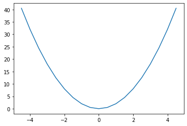

x = np.arange(-5, 5, 0.1)
y1 = x**2 -2
y2 = 20 * np.cos(x)**2

plt.figure(1) #1번 그래프 창 생성
plt.plot(x, y1)
plt.figure(2) #2번 그래프 창 생성
plt.plot(x, y2)
plt.figure(1) # 이미 생성된 1번 그래프 창을 지정
plt.plot(x, y2)
plt.figure(2) #이미 생성된 2번 그래프 창을 지정
plt.clf() # 2번 그래프 창에 그려진 모든 그래프를 지움
plt.plot(x,y1) #지정된 그래프 창에 그래프를 그림
plt.show()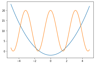

x = np.arange(0, 10, 0.1)
y1 = 0.3*(x-5)**2 + 1
y2 = -1.5*x +3
y3 = np.sin(x)**2
y4 = 10*np.exp(-x) + 1
# 2x2 행렬로 이루어진 서브 그래프에서 p에 따라 위치를 지정
plt.subplot(2,2,1) # p는 1
plt.plot(x,y1)
plt.subplot(2,2,2) # p는 2
plt.plot(x,y2)
plt.subplot(2,2,3) # p는 3
plt.plot(x,y3)
plt.subplot(2,2,4) # p는 4
plt.plot(x,y4)
plt.show()
xlim(), xlim() - 그래프의 x축, y축의 범위 설정
x = np.linspace(-4, 4, 100)
y1 = x**3
y2 = 10*x**2 -2

plt.plot(x,y1,x,y2)
plt.xlim(-1,1) # x축의 범위를 -1에서 1로 한정
plt.ylim(-3,3) # y축의 범위를 -3에서 3로 한정
plt.show()
그래프 그리기 예시
import matplotlib

matplotlib.rcParams['font.family'] = 'Malgun Gothic'
matplotlib.rcParams['axes.unicode_minus'] = False
plt.plot(x, y1, '>--r', x, y2, 's-g', x, y3, 'd:b', x, y4, '-.Xc')
plt.legend(['데이터1', '데이터2', '데이터3', '데이터4'], loc = 'best')
plt.xlabel('X 축')
plt.ylabel('Y 축')
plt.title('그래프 제목')
plt.grid(True)
import matplotlib.pyplot as plt

height = [165,177,160,180,185,155,172]
weight = [62,67,55,74,90,43,64]

plt.scatter(height, weight)
plt.xlabel('Height(m)')
plt.ylabel('Weight(Kg)')
plt.title('Height & Weight')
plt.grid(True)
plt.scatter(height, weight, s=500, c='r')
plt.show()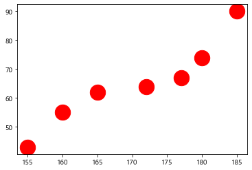
city = ['서울', '인천', '대전', '대구', '울산', '부산', '광주']
# 위도(latitude)와 경도(longitude)
lat = [37.56,37.45,36.35,35.87,35.53,35.18,35.16]
lon = [126.97,126.70,127.38,128.60,129.31,129.07,126.85]
#인구 밀도(명/km^2): 2017년 통계청 자료
pop_den = [16154,2751,2839,2790,1099,4454,2995]

size = np.array(pop_den) * 0.2 # 마커의 크기 지정
colors = ['r', 'g', 'b', 'c', 'm', 'k', 'y'] # 마커의 컬러지정
plt.scatter(lon, lat, s=size, c=colors, alpha=0.5)
plt.xlabel('경도(longitude)')
plt.ylabel('위도(latitude)')
plt.title('지역별 인구 밀도(2017)')

for x, y, name in zip(lon, lat, city):
    plt.text(x, y, name) # 위도 경도에 맞게 도시 이름 출력
plt.show()
member_IDs = ['m_01', 'm_02', 'm_03', 'm_04']
before_ex = [27, 35, 40, 33]
after_ex = [30,38,42,37]
n_data = len(member_IDs)
index = np.arange(n_data)
plt.bar(index, before_ex)
plt.show()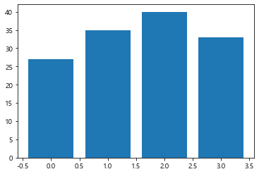
barWidth = 0.4
plt.bar(index, before_ex, color='c', align='edge', width = barWidth, label='before')
plt.bar(index + barWidth, after_ex, color='m', align='edge', width = barWidth, label='after')

plt.xticks(index + barWidth, member_IDs)
plt.legend()
plt.xlabel('회원 ID')
plt.ylabel('위몸일으키기 횟수')
plt.title('운동 시작 전과 후의 근지구력(복근) 변화 비교')
plt.show()
fruit = ['사과', '바나나', '딸기', '오렌지', '포도']
result = [7,6,3,2,2]
plt.pie(result)
plt.show()
plt.figure(figsize=(5,5))
plt.pie(result, labels = fruit, autopct='%.1f%%')
plt.show()
explode_value = (0.1,0,0,0,0)

plt.figure(figsize=(5,5))
plt.pie(result, labels=fruit, autopct='%.1f%%', startangle=90, counterclock=False, explode=explode_value, shadow=True)
plt.show()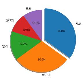
import pandas as pd

temperature = [25.2,27.4,22.9,26.2,29.5,33.1,30.4,36.1,34.4,29.1]
Ice_cream_sales = [236500,357500,203500,365200,446600,574200,453200,675400,598400,463100]

dict_data = {'기온':temperature, '아이스크림 판매량':Ice_cream_sales}
df_ice_cream = pd.DataFrame(dict_data, columns=['기온', '아이스크림 판매량'])
df_ice_cream

df_ice_cream.plot.scatter(x='기온', y='아이스크림 판매량', grid=True, title='최고 기온과 아이스크림 판매량')
plt.show()
wordcloud를 이용한 데이터 통계
import pandas as pd

word_count_file = "C:/pywork/word_count.csv"
word_count = pd.read_csv(word_count_file, index_col = '단어')
word_count.head(5)

->
	빈도
단어
산업혁명	1662
기술	1223
사업	1126
혁신	1084
경제	1000
from wordcloud import WordCloud
import matplotlib.pyplot as plt
korean_font_path = 'C:/Windows/Fonts/malgun.ttf'wc = WordCloud(font_path=korean_font_path, background_color='white')
frequencies = word_count['빈도'] # pandas의 Series 형식
wordcloud_image = wc.generate_from_frequencies(frequencies)wc = WordCloud(font_path=korean_font_path, background_color='white')
frequencies = word_count['빈도'] # pandas의 Series 형식
wordcloud_image = wc.generate_from_frequencies(frequencies)
반응형
'Python' 카테고리의 다른 글
| [Python] Pandas 사용 (0) | 2021.07.28 |
|---|---|
| [Python] Numpy 사용 (0) | 2021.07.27 |
| [Python] 명령문으로 파일 생성, 작성, 읽어오기 (0) | 2021.07.27 |
| jupyter notebook 에서 Python 파일 생성 / 폴더(directory) 생성 방법 (0) | 2021.07.27 |
| [Python] split(), strip(), find(), startswith(), endswith(), replace(), isalnum(), isspace() 함수 (0) | 2021.07.27 |